

Jacquemus
Part Three


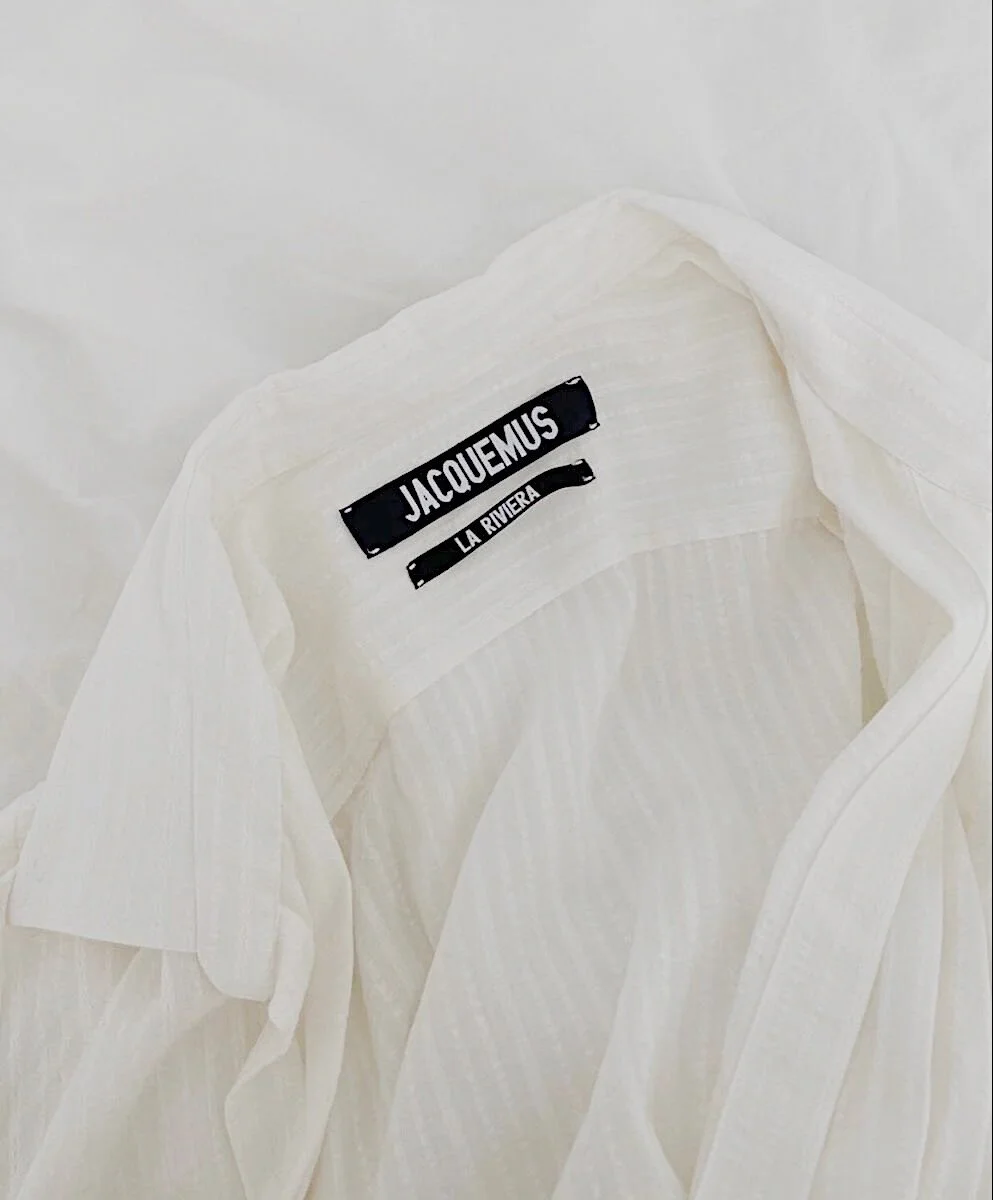
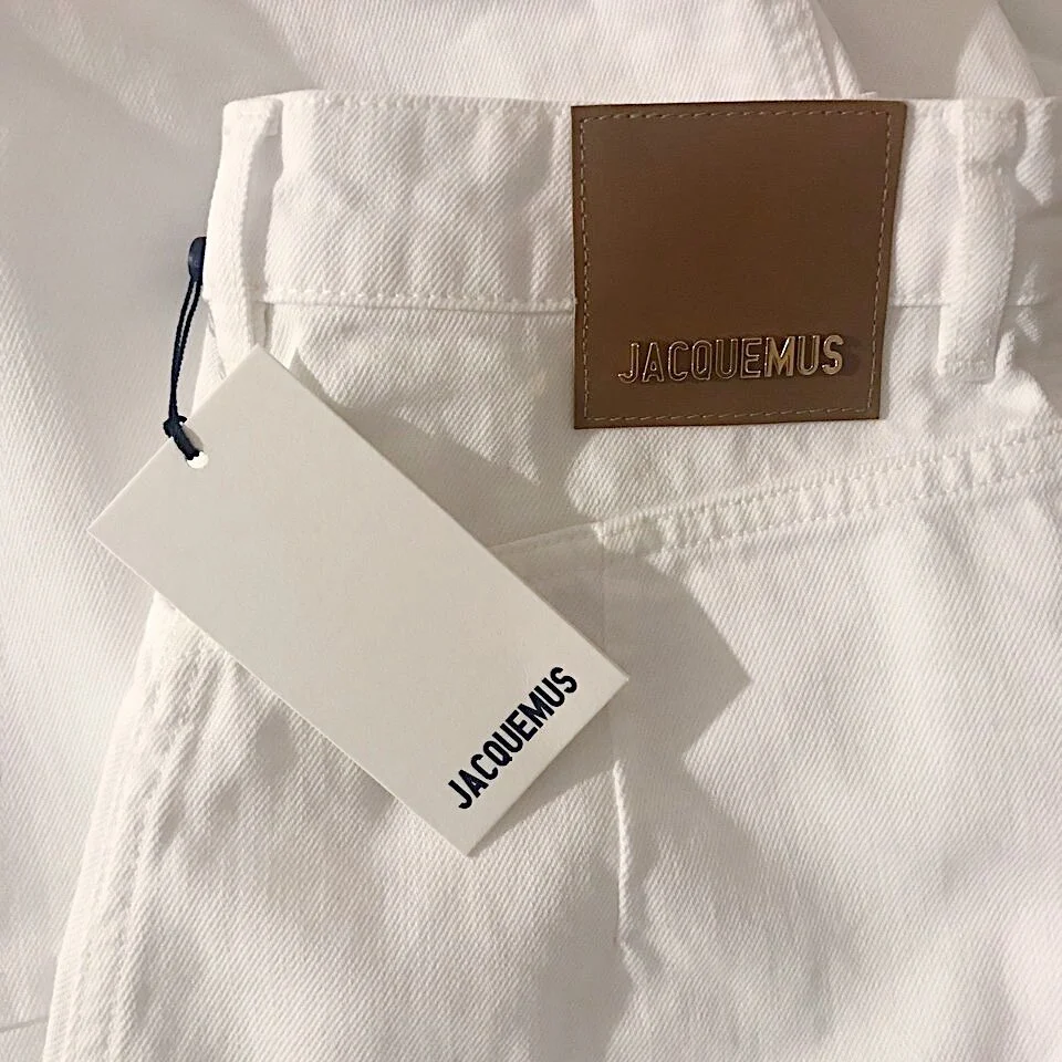
The Jacquemus signature is simple yet bold. The full name is spelled out to identify the brand. Occasionally a simple ‘J’ will be placed on smaller products including keychains and jewelry to signify the designer. The Jacquemus homepage uses the left logo’s colorway in the header, and the social media platforms (Instagram, Facebook, and TikTok) use the right logo’s colorway. The typography used for the logotype is Real Madrid 2009. Colors have shifted from white and navy to include a neutral color palette of deep navy, black, white, and beige.
I love the Jacquemus signature. I think it keeps the youthful and artistic brand close to its Parisian roots. Its simplicity, femininity, and sophistication are versatile and becoming extremely recognizable. It can be altered to fit any season, collection theme, or color scheme that Simon Porte Jacquemus thinks of next. The touchpoints displayed above are Jacquemus’ labels, tags, packages, boxes, advertising, digital campaigns, website, social media platforms, fashion show invitations and events, and additional ephemera.


Inspiration, Images, & Information from…
Anderson, Kristin. “Just Kids: Why Simon Porte Jacquemus Doesn't Need Clothes to Advertise His Namesake Brand.” Vogue, Vogue, 1 Feb. 2017, www.vogue.com/article/jacquemus-fall-2016-campaign-interview.
Arnett, George. “Data Analysis Shows Jacquemus as Fashion's Top Breakout Brand.” Vogue Business, 15 Apr. 2020, www.voguebusiness.com/fashion/data-analysis-breakout-brands-jacquemus-marine-serre-bode.
“Jacquemus.” Facebook, https://www.facebook.com/JACQUEMUSPARIS/?ref=page_internal.
“Jacquemus.” Instagram, www.instagram.com/jacquemus.